When a manuscript transitions from an author glowing screen to a physical volume, something fundamental alters in how the story is experienced. The quiet weight of heavy paper stock, the subtle tooth of natural fibers, and the deliberate spacing of leaded lines give prose a permanent place in the tangible world. At Verita Media House, we treat print production not as a routine manufacturing step, but as the final act of literary translation.
Selecting Paper with Tactile Intent
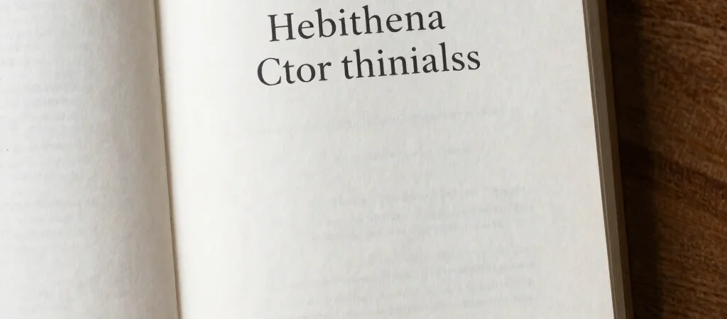
The choice between crisp off-white and warm cream paper determines how long a reader can linger on a page without eye fatigue. Uncoated sheets absorb ink in a way that creates a soft, organic edge around serif letters, anchoring the prose directly into the grain. We examine tone, opacity, and basis weight for every title to ensure the physical book complements the emotional register of the story.
Typography That Honors Narrative Pace
A well-set page directs the reader breath without ever calling attention to its own mechanics. Adjusting tracking, leading, and gutter widths allows the narrative to flow naturally across every double-page spread. When typography is crafted with care, the physical interface disappears and the reader dissolves into the author world.
Building Books Meant to Endure
Digital formats offer unmatched convenience, but physical bindings carry memory across generations. From smyth-sewn signatures that lay flat on a wooden desk to subtle foil-stamped cloth spines, our production process honors traditional bookmaking. Every edition is constructed as an artifact meant to be kept, shared, and revisited over a lifetime.